[Click here to view the video in this article]
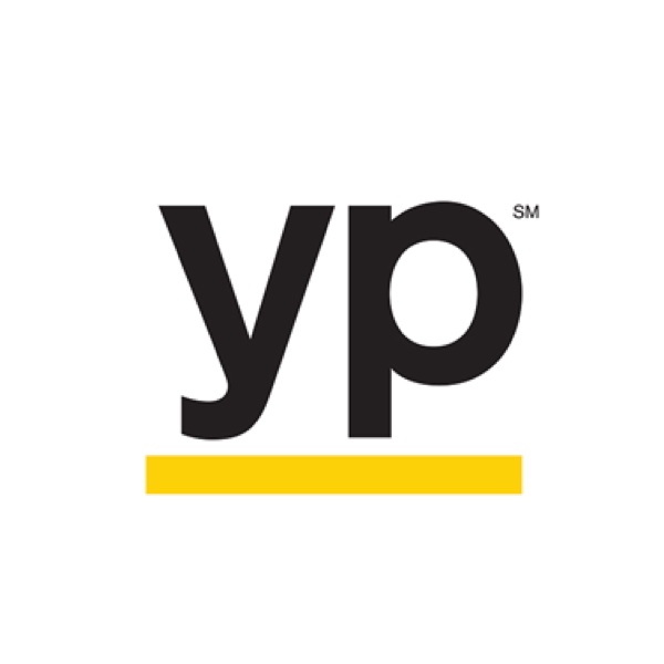
New Logo
Yellow Pages, the international company of telephone directory for businesses, has been given a new look.
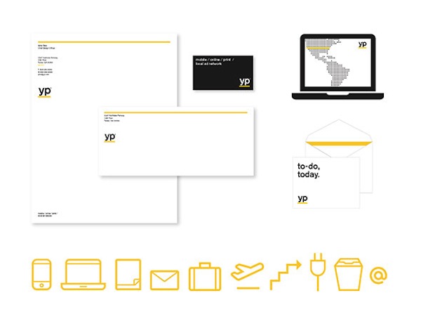
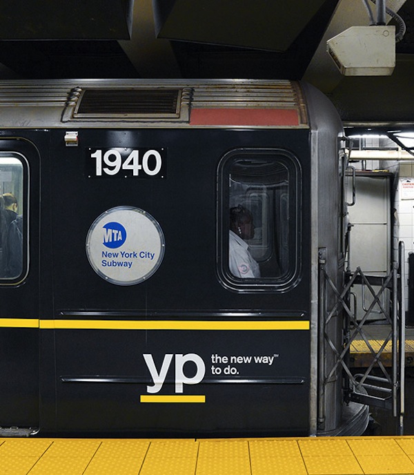
Created by Interbrand NY and BarrettSF, the updated visual identity of the brand moves away from the app-inspired look to simply spell out the abbreviation of the company’s name, “yp”, in lowercase bold sans serif font, and underline it in yellow.
“We were inspired by the gestures of the multi-tasker: underlines, checkmarks, circles, and highlights—where the yellow line becomes a visual shorthand for efficiency and task completion,” Forest Young, Creative Director at Interbrand NY, said in a statement
The new look targets people that are task-oriented, “doers”, who need to find other people to complete things they need to get done.
“YP is here to help people get things done. Everything we do is designed to make doing easier. That goes for our brand identity too. How we act, how we look, how we speak. Every YP experience should be simple, clear and quick,” Interbrand NY added.
What do you think of Yellow Pages’ new logo?
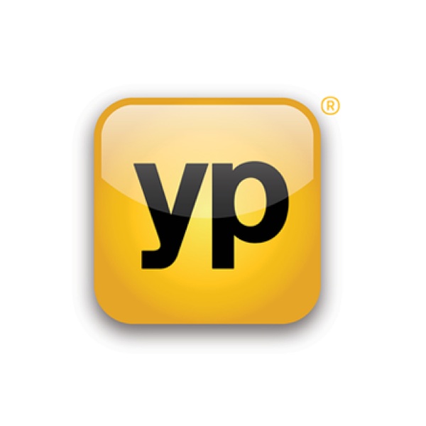
Old Logo
[via POPSOP and Underconsideration]
New Logo
Yellow Pages, the international company of telephone directory for businesses, has been given a new look.
Created by Interbrand NY and BarrettSF, the updated visual identity of the brand moves away from the app-inspired look to simply spell out the abbreviation of the company’s name, “yp”, in lowercase bold sans serif font, and underline it in yellow.
“We were inspired by the gestures of the multi-tasker: underlines, checkmarks, circles, and highlights—where the yellow line becomes a visual shorthand for efficiency and task completion,” Forest Young, Creative Director at Interbrand NY, said in a statement
The new look targets people that are task-oriented, “doers”, who need to find other people to complete things they need to get done.
“YP is here to help people get things done. Everything we do is designed to make doing easier. That goes for our brand identity too. How we act, how we look, how we speak. Every YP experience should be simple, clear and quick,” Interbrand NY added.
What do you think of Yellow Pages’ new logo?
Old Logo
[via POPSOP and Underconsideration]