To kick off our ‘Year in Review’ series, we have selected 10 of the top logo redesigns of 2013. From the subtle changes of Instagram’s logo to Yahoo’s complete design overhaul, it seems like brands tend to favor the ‘minimalistic’ look. What do you think?
Top 10 Most-Talked-About Logo Redesigns Of 2013
10. Mozilla Unveils New Simplified Firefox Logo

Mozilla’s redesigned logo for Firefox was different from many other logo revisions, in that it was not made to have a ‘flat’ look. The design still leaned towards a cleaner look, with the removal of ‘excess fur detail’ and the usage of softer gradients. The logo was designed for better clarity on devices with lower resolution.
9. Instagram Sports A Subtle Logo Redesign
New Logo

Old Logo

Instagram has become the ubiquitous, choice photo-sharing app amongst smart phone users, and it made sense for the brand to update its logo for a more professional feel. The old logo featured a casual, playful ‘Billabong’ typeface, which was tweaked slightly for a smoother, neater look. The change was subtle, but it made the logo more pleasing to the eye.
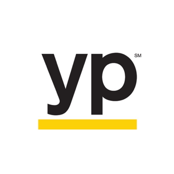
8. ‘Yellow Pages’ Gets A Refreshed Logo
New Logo
Old Logo
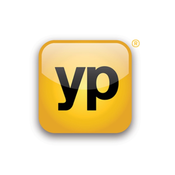
The Yellow Pages’ logo redesign was probably the most exciting thing to happen to the brand in a long time. Hopping on the minimalist bandwagon, the brand updated its logo with a clean, flat look, keeping the ‘yp’ and removing everything else. The new ‘yp’ initials were underlined with a bold, yellow line and placed on a transparent background.
7. Artificial Sweetener Brand ‘Equal’ Gets New Logo

Popular artificial sweetener brand ‘Equal’ updated its logo after more than 20 years, and the new look featured the same blue and white color theme, but a completely altered font. The brand switched from uppercase letters to a soft, cursive typeface, and like the others, kept the look minimal.
6. Microsoft's Bing Unveils A New Logo
New Logo

Old Logo

Microsoft revised its ‘Bing’ logo after a few other Internet giants updated their logos, and we’re not sure if it was a timely move. The revision was made in line with an all-around site revamp which aimed to refresh consumers’ mind-set of the brand. The logo was fashioned to match the Microsoft logo—the wide, rounded typeface was altered for a slimmer, tighter look.
5. T.G.I.Friday’s Unveils New Logo

US restaurant chain T.G.I.Friday’s new logo featured a sleeker and more modern look, dropping the punctuation in its name to read “TGI Fridays”. It also changed its original shape in favor of a rectangular border formed by its bold, red-and-white diagonal stripes.
4. ‘7-Eleven’ Unveils Refreshed Logo And Store Design

Dublin, Ohio-based WD Partners gave convenience store chain 7-Eleven a complete makeover, replacing its trademark red and green logo and overhauling its store design. The new logo for the store front featured the “7” of the old logo paired with a white lowercase “eleven” against a black background, while the brand identity featured the logo against a bright green background. According to WD Partners, the new look was aimed at attracting the millennial and female demographics.
3. Facebook Reveals New Logo
Old (Left), New (Right)

Social networking giant Facebook debuted a new logo and redesigned icons earlier this year. The new logo does away with the faint blue line at the bottom, and lowered the “f” so that it touches the edge of the box, making for a cleaner and less cluttered look.
2. Google Sports A Subtle, ‘New’ Logo Design

Not to be outdone, search engine company Google got in on the logo redesign action but with a twist – it did not replace the original logo but instead will only use its ‘redesigned logo’ on occasions when the original beveled logo “may not display well.” The ‘new logo’ featured a flatter design with slightly muted colors.
1. Yahoo! Unveils Its New Logo

Yahoo’s new logo was one of the most-talked about logo redesigns of 2013. In the lead-up to the unveiling, Yahoo! ran a ’30 Days of Change’ campaign where it debuted a new logo every day for 30 days. The final design featured an embossed style, a different font type and a more streamlined logo. Bob Stohrer, Senior Vice President of Brand Creative, said “We wanted to something that represented the sophistication and elegance of Yahoo! today, while still bringing forward the hallmarks of the brand that people have come to love.”
Top 10 Most-Talked-About Logo Redesigns Of 2013
10. Mozilla Unveils New Simplified Firefox Logo

Mozilla’s redesigned logo for Firefox was different from many other logo revisions, in that it was not made to have a ‘flat’ look. The design still leaned towards a cleaner look, with the removal of ‘excess fur detail’ and the usage of softer gradients. The logo was designed for better clarity on devices with lower resolution.
9. Instagram Sports A Subtle Logo Redesign
New Logo
Old Logo
Instagram has become the ubiquitous, choice photo-sharing app amongst smart phone users, and it made sense for the brand to update its logo for a more professional feel. The old logo featured a casual, playful ‘Billabong’ typeface, which was tweaked slightly for a smoother, neater look. The change was subtle, but it made the logo more pleasing to the eye.
8. ‘Yellow Pages’ Gets A Refreshed Logo
New Logo
Old Logo
The Yellow Pages’ logo redesign was probably the most exciting thing to happen to the brand in a long time. Hopping on the minimalist bandwagon, the brand updated its logo with a clean, flat look, keeping the ‘yp’ and removing everything else. The new ‘yp’ initials were underlined with a bold, yellow line and placed on a transparent background.
7. Artificial Sweetener Brand ‘Equal’ Gets New Logo
Popular artificial sweetener brand ‘Equal’ updated its logo after more than 20 years, and the new look featured the same blue and white color theme, but a completely altered font. The brand switched from uppercase letters to a soft, cursive typeface, and like the others, kept the look minimal.
6. Microsoft's Bing Unveils A New Logo
New Logo
Old Logo
Microsoft revised its ‘Bing’ logo after a few other Internet giants updated their logos, and we’re not sure if it was a timely move. The revision was made in line with an all-around site revamp which aimed to refresh consumers’ mind-set of the brand. The logo was fashioned to match the Microsoft logo—the wide, rounded typeface was altered for a slimmer, tighter look.
5. T.G.I.Friday’s Unveils New Logo
US restaurant chain T.G.I.Friday’s new logo featured a sleeker and more modern look, dropping the punctuation in its name to read “TGI Fridays”. It also changed its original shape in favor of a rectangular border formed by its bold, red-and-white diagonal stripes.
4. ‘7-Eleven’ Unveils Refreshed Logo And Store Design
Dublin, Ohio-based WD Partners gave convenience store chain 7-Eleven a complete makeover, replacing its trademark red and green logo and overhauling its store design. The new logo for the store front featured the “7” of the old logo paired with a white lowercase “eleven” against a black background, while the brand identity featured the logo against a bright green background. According to WD Partners, the new look was aimed at attracting the millennial and female demographics.
3. Facebook Reveals New Logo
Old (Left), New (Right)
Social networking giant Facebook debuted a new logo and redesigned icons earlier this year. The new logo does away with the faint blue line at the bottom, and lowered the “f” so that it touches the edge of the box, making for a cleaner and less cluttered look.
2. Google Sports A Subtle, ‘New’ Logo Design
Not to be outdone, search engine company Google got in on the logo redesign action but with a twist – it did not replace the original logo but instead will only use its ‘redesigned logo’ on occasions when the original beveled logo “may not display well.” The ‘new logo’ featured a flatter design with slightly muted colors.
1. Yahoo! Unveils Its New Logo
Yahoo’s new logo was one of the most-talked about logo redesigns of 2013. In the lead-up to the unveiling, Yahoo! ran a ’30 Days of Change’ campaign where it debuted a new logo every day for 30 days. The final design featured an embossed style, a different font type and a more streamlined logo. Bob Stohrer, Senior Vice President of Brand Creative, said “We wanted to something that represented the sophistication and elegance of Yahoo! today, while still bringing forward the hallmarks of the brand that people have come to love.”